Amazon Listing Images: Can These 55 Image Design Hacks To Jumpstart Your Amazon Conversions?
If you want to learn some great hacks for your Amazon Listing Images, you are in the right place!
When listing products on Amazon, the use of images for product listings is a powerful tool for boosting sales.
Great images can grab attention, stir up desire and cause action. However, creating compelling images for your Amazon listings can be difficult. This guide will give you 55 image design hacks to help you make additional images to jumpstart and supercharge your Amazon conversions.
Table of Contents
What Are Amazon Listing Images?
Amazon Listing Images promote products on Amazon. They are usually displayed prominently on the product page and A+ content. They can be used to highlight features and benefits and to increase customer engagement.
Image Design Hacks are techniques used to create images that grab attention, stir up desire, and cause action. These 55 hacks can help brands create eye-catching images that stand out from the competition and boost conversions.
The Challenge is creating eye-catching images that stand out from the competition while ensuring that all images also meet Amazon’s guidelines and restrictions – that’s where the Hacks help.
How Do Amazon Product Images Affect Conversion Rates?
Amazon Product Images can have a significant impact on conversion rates by emotionally drawing shoppers into the benefits of your products. Customers are more likely to purchase a product if they are able to visualize how it looks, how it works, and what it will do for them. High-quality images that clearly show the features and benefits of the product will help customers make an informed decision about whether or not they want to purchase it.
6 Different Types of Amazon Product Images
When creating images for your Amazon listings, there are 6 types of images that you should consider creating:
-
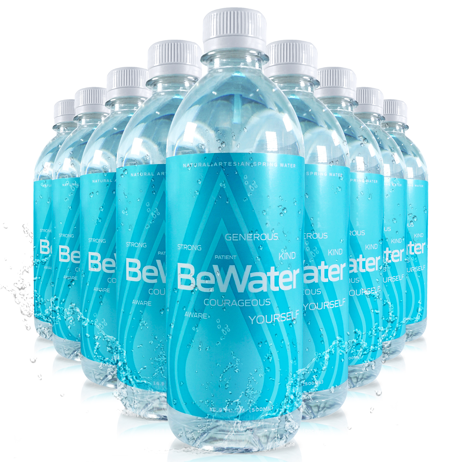
The Amazon Main Image is the first image of the product image stack that is displayed prominently on the product page. This image should be clear, concise, and focused on the benefits of the product rather than its features.
-
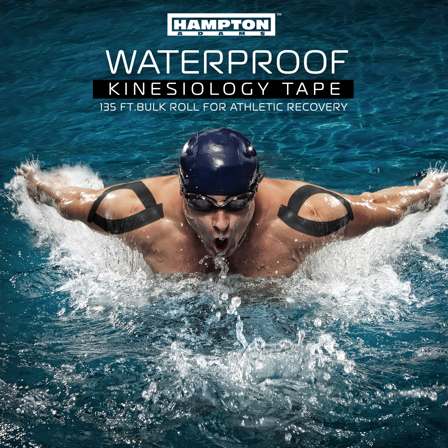
The Title Image is a secondary image that is used to introduce the product to shoppers (kind of like your listing cover art) This image should be clear, concise, and focused on the features of the product rather than its benefits.
-
The Lifestyle-Plus Image is an image that shows how the product is used in everyday life. This image should be visually appealing and focus on how the product can improve someone’s life rather than just showing what it looks like.

-
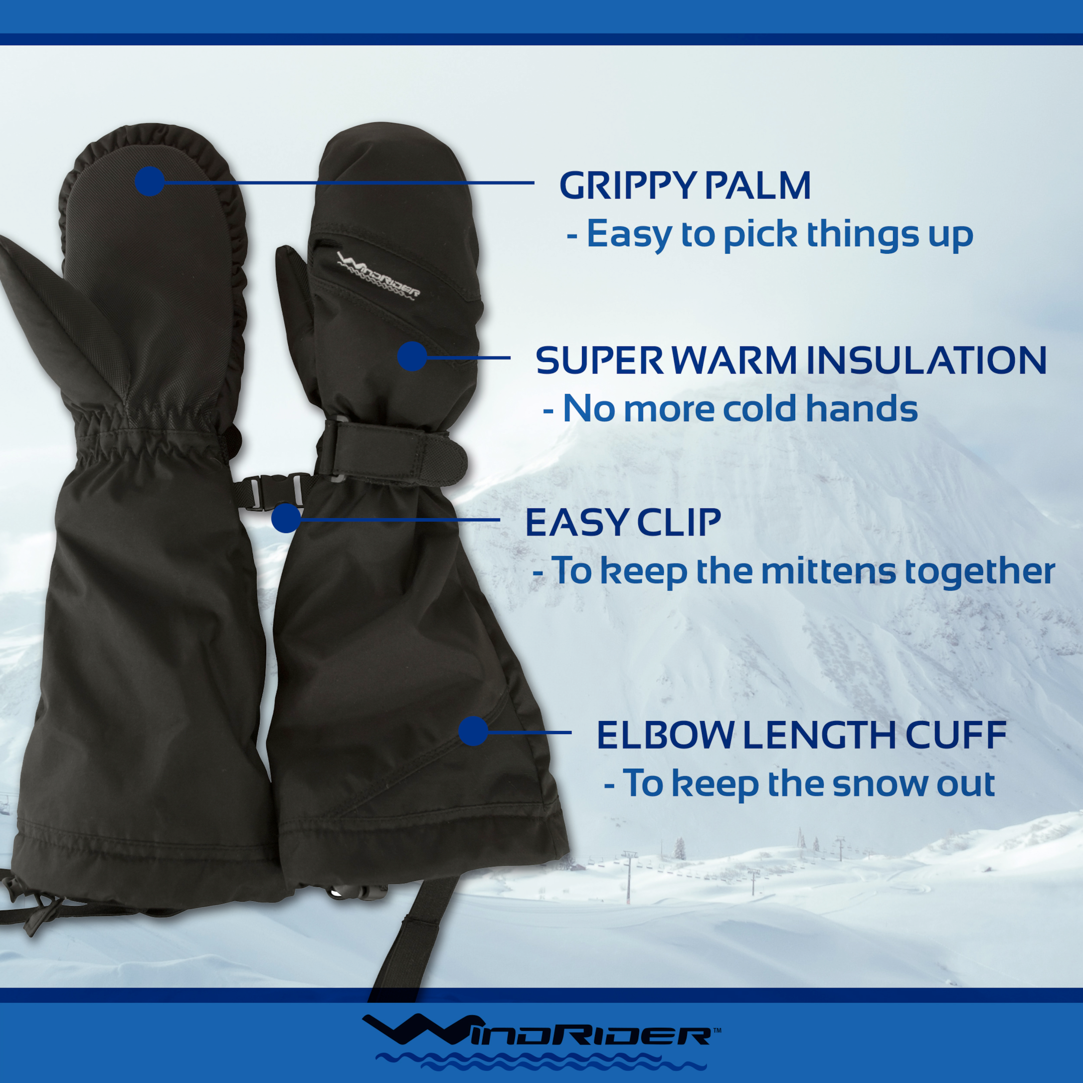
The Infographic Image is an image that provides information about the product in a visually appealing way. The infographic should be focused on providing useful benefits and facts about the product in an easy-to-understand format.
-
The Psuedo Testimonial Image is an image that shows a customer with some quoted text describing a benefit of the product. This image should be focused on showing how customers will feel when they use the product.
-
The What’s In The Box Image is an important image for ingredient-driven products like kits, medications, and supplements. This image should clearly show what the shopper will get with their purchase in an easy-to-understand format.
The Amazon Main Product Image (Hacks 1-16)
The Amazon Main Image is displayed prominently on the search results page (SERPs) and on the top of the product page.
Minimum Requirements for Amazon Main Images Include:
-
Professional quality in RGB color mode
-
A resolution of at least 1,000 pixels or larger on the longest side.
-
A 10-pixel all-white border (the no-go zone where there can be no shadows or product intrusion)
-
The product must take up 80% or more of the space
-
Product on an all-white/pure white background (hex code #FFFFFF)
-
No excessive shadows or reflections
-
Does not contain any watermarks or copyright symbols
-
Does not contain writing or callout
The main image is the most regulated image in your entire Amazon listing. Amazon only wants main images that are focused solely on the product in a clear, concise way that is simple.
-
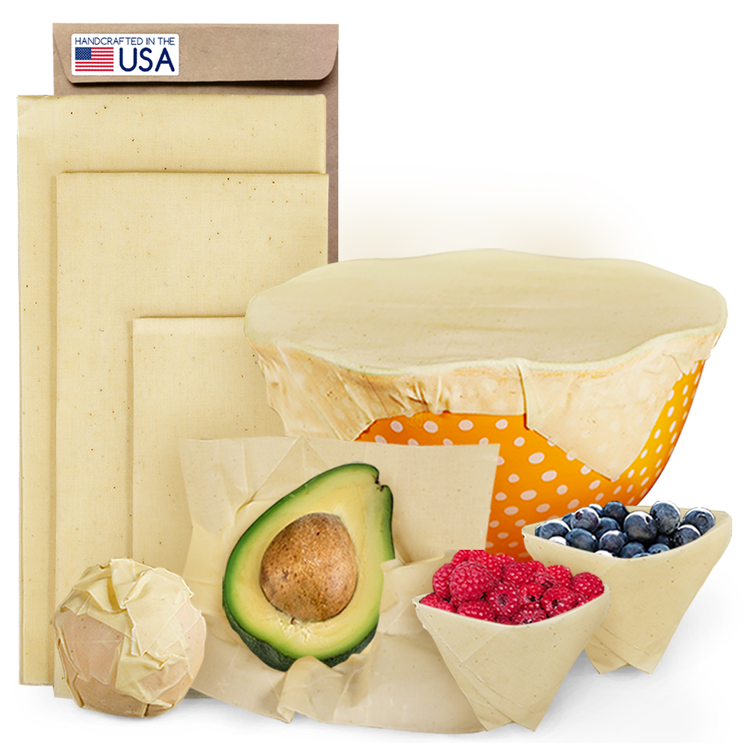
The Flag Hack: Using a Patriotic Flag on Your Amazon Main Image to Increase Conversions by grabbing the attention of your patriotic buyers who want to support local manufacturing
-
The Box Hack: Use the product packaging in the main image (in place of callouts) to help show benefits and features.
-
The Hand Hack: Include a Hand in the Main images on Your Amazon product detail page to increase curiosity (this is not allowed in all categories – so test and see)
-
The Fruit Hack: On the Amazon listing, feature vibrant images of the components/ingredients used in your product, particularly a great hack for items made from food or natural ingredients
-
The Desire Hack: What do your customers truly want? A tidy home? A happy pet? Clear skin? Put it on the main image.
-
The USP Hack: What makes your product stand out from the competition? What is your Unique Selling Proposition? Make sure to include that on your Amazon main product image to draw in customers.
-
The Celeb Hack: Focusing on using influencers or celebrities in your photo shoots, and featuring their face on your main image.
-
The Box v2 Hack: You don’t have packaging? Don’t let that stop you…create a simulated packaging design if there isn’t any physical packaging, and use digital renders to make it look realistic.
-
A Face Hack: Human eyes are drawn to faces which makes them one of the most recognizable objects. To maximize your click-through, consider including a face in your main product image to grab potential buyers’ attention. Additionally, you should also choose an attractive and appropriate model that reflects the overall theme and demographic of your product or brand.
-
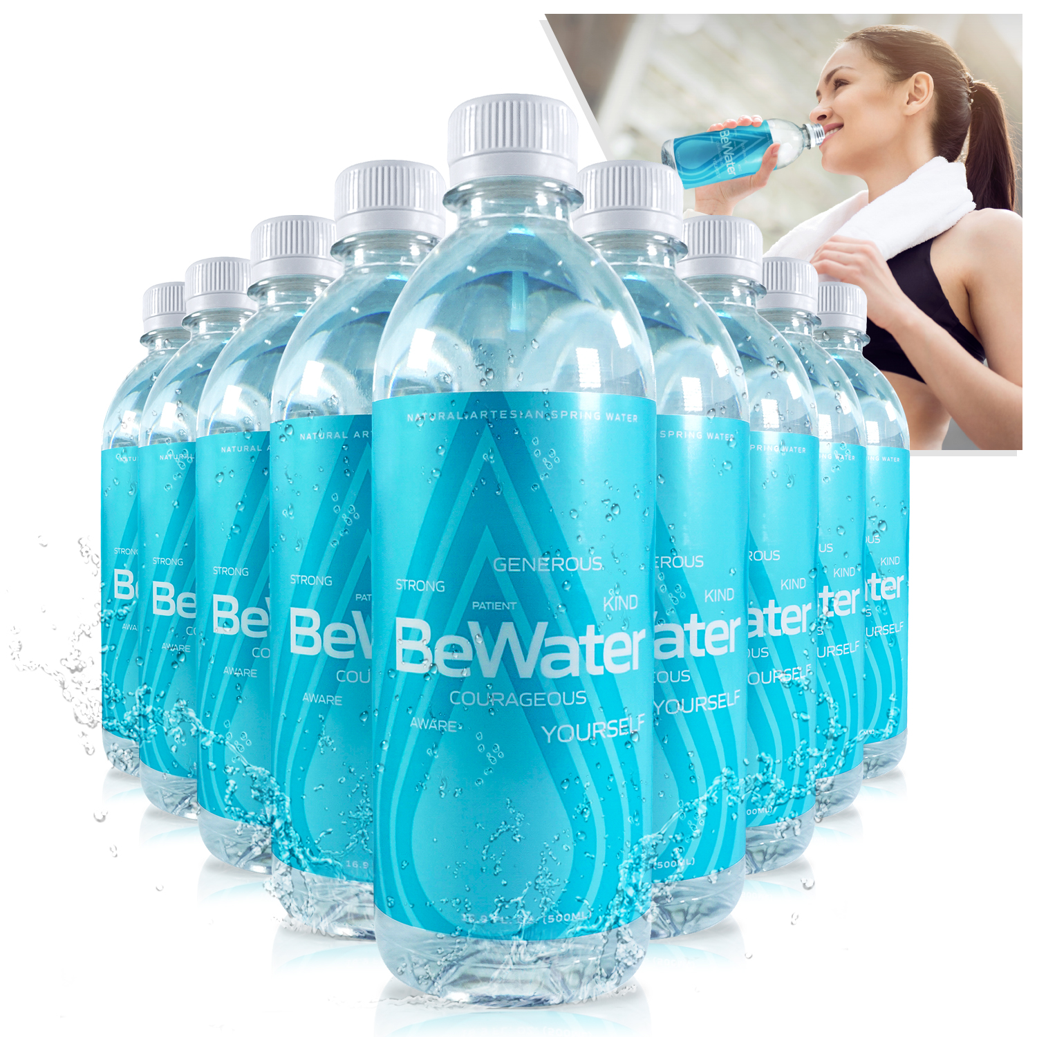
The Callout Hack: While Amazon’s terms of service (TOS) restrict product images from containing any text, logos, or graphics that doesn’t mean you can’t sneak them in, but be prepared with a backup “safety” image. Consider tucking a callout behind the product in a way that the Algorithm won’t see it as separate from the product. Note that all visuals should accurately represent what is included in your item’s package and should not contain content that could mislead customers into thinking they are purchasing something other than what is actually shipped with their order.
-
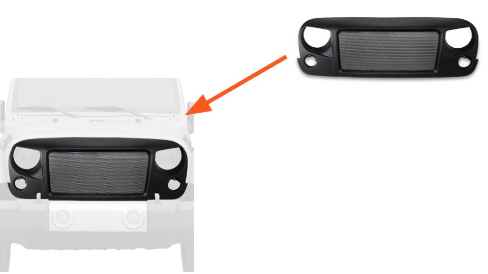
The Ghost Hack: Ghost Props are a creative way of showcasing an accessory or add-on product in relation to another, original product. For example, if you were selling an after-market Jeep front grill on Amazon, you could use ghost props to demonstrate how that grill would look when installed on a Jeep. This is done by displaying the existing Jeep as a grayscale outline (i.e., “ghost”), while your new grill is presented in vibrant full color on the Jeep. By using this technique, customers can easily visualize what their purchase will look like once they’ve added it on.
-
The Max Hack: Make the product take up as much of the image space as possible. This means that you should try to fill up most of the image with the product, right up to the 10px border. Doing so will help draw attention directly to your item and also create a sense of scale for potential customers. Additionally, having a larger product in the composition helps make your product look more important than your competitors (who failed to read this post).
-
The Negative Hack: The required pure white background rule can make certain objects hard to see or stand out. To combat this issue, you should consider testing “negative fill” for your product images. This technique creates shadows around the edges of shiny or translucent objects to help them appear more distinct against the white background. Negative fill can be achieved by using a black card behind a transparent object and placing that in front of a light source – this will create an outline effect that adds depth to your image and makes it easier for customers to pick out details about your product.
-
The Mock Hack: Testing a new label design can help boost your click-through rate. No need to actually print a new label, just design a new label and then mock it up onto your existing products. Use it in all photos (not just the main image). However, you should add a disclaimer in the description that the packaging of the shipped item may vary from what is seen in the image. This will help ensure customers are informed and avoid any confusion or disappointment when their order arrives. Testing out different labels can be a great way to gain insights into customer preferences and buying habits – helping you optimize your product listings for maximum conversions!
-
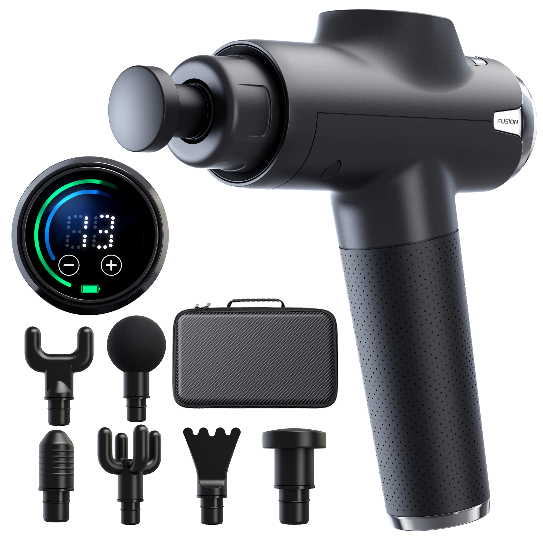
Go 3D Hack: Renders are a great way to showcase your product in an eye-catching and professional manner. Using 3D rendering technology, you can create images that look incredibly realistic (sometimes surreal) and capture the attention of potential buyers. Test a 3D-rendered design of your physical product to see how it looks and if it grabs new traffic you didn’t have before.
-
Add Contrast Hack: Consider the contrast of both the product and its packaging. Testing a low-contrast or translucent product against high-contrast packaging can help you draw more attention from potential customers. Translucent and low-contrast products tend to be more subtle in appearance (especially against all-white backgrounds), while high-contrast packaging stands out better and grabs people’s attention more easily. Experimenting with multiple combinations can help determine which type of image design yields the best results for conversions on your Amazon platform.
Design Hacks for Secondary Images
When creating images for your Amazon listings (other than the Main Image) there are several design hacks that you should consider using. That is what the remaining hacks cover…
Standards for Secondary Images
When creating images for your Amazon listings there are several standards that all images in the stack must be met in order to ensure they meet Amazon’s guidelines image requirements & restrictions:
-
Secondary images have minimum resolution requirements (1000×1000 pixels)
-
Secondary images must also be in one of these appropriate file extension types: JPEG (.jpg), TIFF (.tif), GIF (.gif), BMP (.bmp), or PNG (.png)
-
Secondary images may have a background color or texture.
Product Image Hacks 17-55
-
Theme Color Hack: Creating a thematically colored image stack with consistent use of your brand’s color palette is a great way to make sure your Amazon images look uniform and professional. Not only will this give off the right impression, but also create an inviting and fun atmosphere that encourages potential customers to click through or purchase. Make sure all the colors you choose are vibrant and reflect the overall aesthetic of your brand.
-
The Backlight Hack: Test different types of backlighting techniques to see how they can boost the appeal of a product. Backlighting helps create depth and texture in an image, which makes it more visually appealing and encourages customers to take notice. Try using both direct and indirect lighting at different angles as well as diffused light sources like natural sunlight or LED lights. Consider changing the position of the subject relative to the light source to produce varying effects. When done correctly, this technique can help make your product stand out from the competition.
-
The Blue Light Hack: Blue-colored backlights can add artistic flair and help draw attention to specific features or details in the image that may be difficult to see without the use of a backlight. Additionally, utilizing different colors of backlight can create a more vibrant and eye-catching look for an image which could potentially lead to higher conversions. It is important to experiment with different lighting techniques when creating your Amazon product images in order to find out what works best for your particular product and brand.
-
The Brand Hack: Add branding to your image stack with your logo. This will help elevate trust and recognition in customers as they are more likely to become familiar with your brand when seeing the logo multiple times. Additionally, this can also increase conversions as customers feel more comfortable buying from “real” brands. When creating the branded image stack, make sure that the logo is large enough to be seen clearly but not so large that it takes away focus from important elements of the product.
-
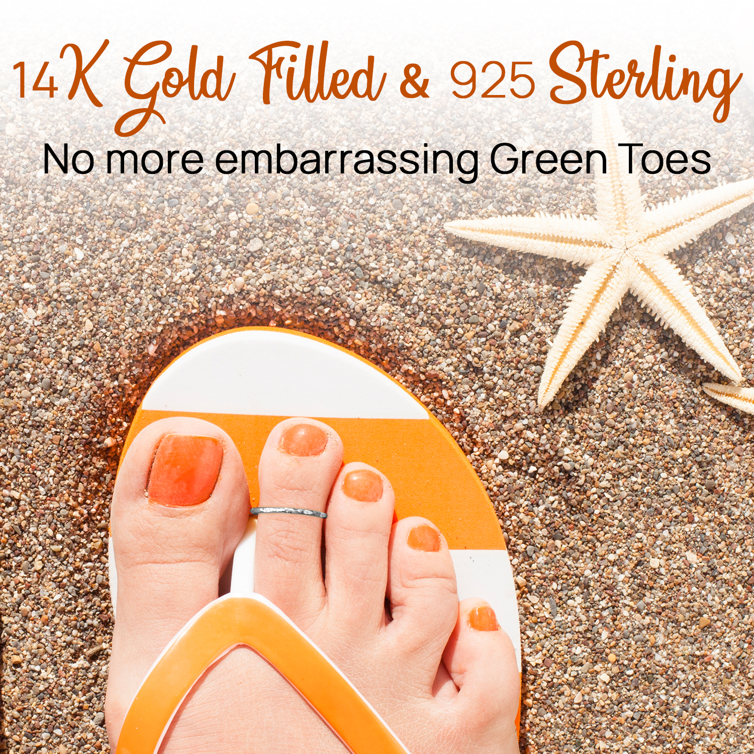
Type Swap Hack: Typography is an important factor to consider when designing product images for Amazon listings. You should experiment with different fonts and see how it affects emotions. Different fonts create a variety of impressions, so make sure to choose one that suits your brand messaging and resonates with the audience you are trying to reach. Additionally, some font choices may be more appropriate for certain age groups or genders than others – take this into account when testing a typographical style.
-
Insta Style Hack: Insta-style images, as seen on Instagram, are characterized by strong visuals and minimal text. These types of pictures can be a great way to grab attention and engage customers with your product listings on Amazon. To utilize this popular style in your product images, aim for bold colors and clever compositions that draw the eye towards key features. Additionally, make sure to incorporate any necessary branding elements or captions while keeping a minimalistic feel; too many words can detract from the visual appeal of the image. With Insta-style images you can effectively communicate what sets your products apart without inundating buyers with unnecessary information.
-
Crop The Face Hack: Test lifestyle images that avoid models looking directly at the camera. Many shoppers find this type of photo cheesy and overly manipulative as they feel like they’re being coerced into an agreement with whatever cheesy gesture or suggestion is in the image. To ensure your product comes across as genuine, try using models who are looking away from the camera or crop out any headshots to focus more on the product itself in use. This will create an impression of authenticity when browsing your store.
-
Scale Up Hack: When designing your Amazon product images, it is important to test higher-resolution images. The minimum required size for an image is 1000px, but you should try to bump up the size even further – to 1500px or even 2000px if possible. By increasing the resolution of your images, shoppers will be able to explore them in greater detail and have a more physical engagement with your product. This can help create a stronger connection between potential customers and your products before they make their purchase decisions.
-
Face To Cam Hack: Earlier we mentioned cropping images to remove the face, in Hack you go the opposite. It may be helpful to include a face-to-camera image with a piece of testimonial language in quotes. This helps make shoppers feel like they are being personally addressed by a real person who has had success with the product. Quoting an enthusiastic customer endorsement in this way is a great way to increase conversions on your page and draw more attention to your products.
-
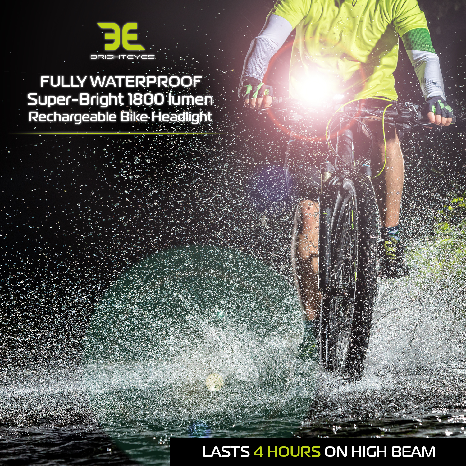
Type Color Hack: Avoid using just black or grayscale fonts as this can come across as dull, unappealing, and amateurish, making it less likely to catch potential customers’ attention. When designing typography for Amazon product photos, make sure the typography colors are consistent with the brand’s color palette. Choosing font colors that are aesthetically pleasing and complementary to each other will help create a cohesive look for your images and better align them with the brand image you’re trying to communicate.
-
Insta Type Hack: Consider current trends in typography on Instagram. For example, modern and minimalistic fonts are popular among users. Furthermore, you should use bold and bright colors that can stand out from the rest of the listing page and draw attention to your product. Additionally, be sure to maintain consistency on all images by using the same typeface throughout your product’s entire lineup. This will give shoppers a sense of familiarity with your brand as they browse through your offerings.
-
Catalog Type Hack: Instagram isn’t the only place that knows what looks good. The typography trends in catalogs is a great resource for inspiring a visually appealing image. By staying up-to-date with the latest design trends and ensuring that the font style and size of your text match those seen in modern catalogs, you can ensure that your listing stands out from competitors.
-
Expensive Wardrobe Hack: Make sure the clothing your models are wearing matches your brand color palette. Not only does this give a unified feeling, but it also makes it appear as if you had the money and resources to wardrobe your models in colors that match your branding. This can significantly increase the perceived value of your brand and will help create more conversions on Amazon. Don’t fret if you are using stock photography, a good Amazon marketing company can change the color of clothing on stock images so that they better fit with your branding scheme. Doing so will ensure that all product images associated with your brand look consistent and professional, leading customers to trust and invest in what you have to offer.
-
Value-Pack Hack: Consider the quantity variation benefit of each SKU you offer. If you are selling value packs of your products (ie. a multi-pack of the same product), make sure that the images associated with each pack size reflect the number of products included in the value pack. You can take advantage of Amazon’s feature which allows you to upload individual image stacks for every variation (SKU). At a minimum consider unique main and title images to show off this value-pack offering clearly and accurately. This will help customers know exactly what they are getting when they click on a particular option. Additionally, if shoppers are looking to buy multiple items at once, they will be able to see how much they save when purchasing a value pack versus buying individual units.

-
Color Swaps Hack: When selling the same product in multiple colors, consider creating a variation stack to showcase each color. Similar to the Value Pack hack above, this hack should include swapping out at least two images – the main image and title image – for each color of your product. Doing this will give buyers a better idea of what they are getting and increase conversions by demonstrating how versatile your product is. Additionally, you can add informative text below the image or use it as part of your listing’s description so that customers know which colors are available.
-
The Headline Hack: Try swapping the headline used in the Title image. Testing different versions of headlines can help you determine which one will have the most impact on conversions. Consider using A/B testing to compare different headlines with a single title image to see which version resonates better with potential customers. This method can help you create more effective Amazon Title images that drive more sales!
-
The CTA Hack: Try adding a soft call-to-action (CTA) such as “try and see for yourself” in the final image. While amazon does not allow hard CTAs, such as “Buy Now” or, “Only 10 Left Buy Today” you can try Soft CTAs on your image stacks or within A+ content to give customers with additional encouragement to purchase your product. It’s important that this CTA is placed prominently so that customers don’t miss it. Additionally, if possible use persuasive language and bright colors in order to capture customer attention and increase conversions.
-
WITB Hack: Test a “What’s In The Box” image as the final image. This will help customers visualize what they’re getting when they purchase the product and can increase their confidence in making a purchase. Include items that are actually included in the box such as manuals and accessories. Make sure to use high-resolution images that clearly show each item inside and remember to crop out any background elements for maximum impact.
-
Precious Materials Hack: Make sure to call out any ‘valuable materials’ that your product contains in the images you use for your Amazon listing. This could be carbon fiber, platinum, unobtainium, or any other material that gives your product a high value. Including these in the image stack will draw attention and show potential customers the quality of what they are buying.
-
Material Benefits Hack: When using the ‘valuable materials’ hack (mentioned above) in your Amazon product images, it’s important to emphasize the benefits of these materials. For example, if you are selling a carbon fiber stand, you should point out that this “stands up to daily use and abuse without becoming damaged (even during combat)”. Additionally, highlighting the benefits of your high-value materials can also help boost sales by emphasizing just how your product can improve the shoppers’ life.
-
Authority Hack: One great way to increase conversions is to appeal to authority. Showing your customers that the product is being used by professionals such as soldiers, athletes, or doctors can be a powerful incentive for shoppers. It demonstrates the trustworthiness of your product and gives them confidence in its quality and performance. Additionally, including well-known figures using your products humanizes your claims and makes your product more relatable. Even tacit endorsements like these are an effective marketing tool – take advantage of their potential when designing your Amazon product photos!
-
The Lab Hack: When it comes to products with a hint of mystery such as supplements or medications, a great way to optimize your lifestyle images is by including an image showing lab-coated workers working in a laboratory setting. This allows potential customers to get an idea of the high level of research and development that goes into producing these products, instilling greater trust in the brand and boosting conversions.
-
The Cookies Hack: This is a bit of a catch-all hack but it gets down to showing soppers what they really want. For example, if you’re selling cookie sheets, make sure that your product images show cookies in them; after all, this is what customers really want – nice tasty cookies that will make family and friends drool.
-
The Tape Hack: It sounds silly, but if you’re selling products designed to help people get thinner, it’s important to back up your claims with proof. One of the best ways to do this is by showing a photo or video of someone measuring their waist – this is truly a picture worth a thousand words. Showing potential customers the success the product will give them offers more confidence than all the facts. Additionally, consider adding customer testimonials from other users who have seen successful results when using the product. This will also build trust among potential buyers and boost sales for your Amazon listing.
-
The Sexy Hack: While it is important to remember that Amazon wants their marketplace to stay family-friendly (which means no explicit or inappropriate content). However, that doesn’t mean you can’t be creative and craft compelling visuals with subtle implications of sexiness. For example, a picture of an attractive woman touching her partner’s face after he shaves is suggestive without being offensive. This type of image could work well for selling the transformation that the man is really looking for from a beard trimmer or razor (hint: he doesn’t care about the beard, he cares about being desired).
-
The Partner Hack: When selling products designed to increase attractiveness, it can also be helpful to show a trusty partner in the background of your product image. For example, you could use an image of a woman snuggling with her man slightly out of focus with your product front and center, sharply in focus. This will create a simple story and an inviting atmosphere that encourages customers to purchase your products as they make a connection between the trusty partner and their potential results from using the product.
-
The No-Sex Hack: This is the opposite of the two previous hacks. It is a creative way to emphasize the importance of using the product (or the threat of not using it). It works by showing the lack of sex between two people, for example, if a man does not use the product then it can be shown that he is being ignored or neglected by a woman as a consequence. This emphasizes how important it is to use the product.
-
Happy Dog Hack: People are looking for ways to improve the quality of life for them and their beloved animals. That’s why a ‘happy dog hack’ shows how life will change with your product. For example, if you’re selling joint health supplements designed specifically for older dogs, show an image of a running dog. This kind of storytelling approach is often very effective in convincing potential customers to purchase because they can “see” their dog being happy right in the picture.
-
Fully Installed Hack: Listen, most shoppers don’t want another project in their life. If you’re selling a kit or something that needs to be installed, make sure your Amazon product images demonstrate what the finished product looks like. A finished product will help potential customers visualize how they can use your products. For example, if you sell fences, include an image of a beautiful yard with the fence already set up and a family safely playing in it. These types of visuals are more likely to grab shoppers’ attention and encourage them to buy than ones that talk about all the pieces and assembly times.
-
The Label Hack: When selling a product, 90% of the process is emotional and 10% is rational. After potential customers have developed an emotional connection to the item, they need to be able to justify their purchase with logical reasons. This can either be for themselves or for someone else who might question it such as a spouse or partner. To help in this justification phase, images should include any relevant information that could potentially apply such as ingredients labels if you are selling supplements, prepared meals, or medications. A simple shot of the label will give shoppers the logic they need when making their decision and provide them with peace of mind that their purchase was justified.
-
The Label+ Hack: After adding a label photo to your Amazon listing, take it one step further and add written benefits for each of the ingredients that you are showcasing. These can be simple statements about how consumers will feel when using the product. For example, if you were selling a morning energy drink, you could write “feel refreshed in the morning” as an associated benefit with that ingredient. Additionally, consider adding visual benefits by including lifestyle imagery depicting someone enjoying the product — such as a woman waking up happy and feeling energized with a warm glow. This type of imagery is often impactful since it allows potential customers to visualize themselves using the product being sold.
-
The Happy Hack: When it comes to product images, you should test shots of happy people in your photos. Having a smiling face can often help create a positive and inviting atmosphere, which will draw customers into your visual storytelling. Showing happier people in the photos that are used for Amazon listings is also proven to be more effective at converting sales than using images with non-smiling or neutral expressions. Additionally, try to include diverse models of all ages, genders, skin tones and sizes so that customers feel represented when looking through your images.
-
The Warm Hack: Try the simple addition of a “warm” filter on all of the images to see if it makes them more visually appealing. A “warm” filter will help enhance colors such as reds and oranges and make an image look warmer (happier) and more inviting. When testing this out, be sure to keep in mind that the warm filter should not overpower or detract from any important imagery in the photo. Additionally, take into account how well the warm filter meshes with other aspects of your design (such as text overlays) before making a final decision.
-
The Cold Hack: The impact of color cannot be overstated. Adding a cold (blue) filter to “before use” pictures or when talking about competitor products (throwing stones) can be an effective way to communicate sad or blue feelings associated with options other than your products.
-
The B4 Hack: Try using classic before and after shots. These types of visuals are known to be effective for a wide variety of products, from hair loss treatments to fat-loss programs to car wax. By utilizing this classic storytelling technique where you show a before shot and an after-use shot in your own images. However, it’s important to remember that these images should always be used tastefully and accurately to represent the actual results achievable with your product. Some notes on using the classic before and after image style, it is important to adhere to a few key color standards. For the “before” image, use black and white for a modern feel. This will help highlight all of the product details that don’t stand out in full-color images. The “after” image should be warmly colored and should showcase how the product looks in its best light. For an extra twist on this classic style, try using a blue color filter for your “before” photo and then switch back to warm tones for your “after” shot. Doing so can add an extra layer of emotional contrast between both images that really pops!
-
The Fall Hack: Instead of writing about how rugged your product its, show your product surviving a fall to demonstrate its durability and ruggedness. For an extra level of reassurance, you can also show customers smiling after the product has safely landed – this will give potential buyers even more confidence in your product’s ability to withstand any impact or rough handling because of the safety features of the product (such as shock-absorbing materials).
-
More Text Hack: Adding more text to your images can be a great way to highlight features, emphasize benefits, or provide additional product information. However, make sure that the text does not cover any critical areas of the product itself.
-
Lose The Text Hack: Sometimes you gotta go with less. Text can often be distracting and take away from the overall aesthetic of your product’s image. To ensure that your images are optimized for conversions, test removing any unnecessary text from them. Doing so will allow customers to focus on the story rather than on reading (which they could do by looking at your bullets). Additionally, if you do need to include text in an image, make sure it is as concise and clear as possible
-
The Artist Swap Hack: To outpace the competition sometimes you just need a fresh perspective. Consider testing completely new image stack designs crafted by different artists. This will give you fresh options that you can A/B test to see which generates increased levels of interest and boost conversions
5 Bonus Amazon Image Hacks
-
The Stone Throwing Hack: Don’t be afraid to point out the flaws of your competitors. Make sure you emphasize why customers should purchase your product instead of theirs. For example, if their products are unsafe or unreliable, make that clear to potential buyers by showing the threat of unsafe or unreliable products (will their product leave you stranded in a dangerous area?). You can also highlight issues with their customer service or build quality; which automatically implies that if they buy from you, they’ll get superior customer service and better build quality than what’s offered by other sellers. Ultimately, it’s important to make sure customers understand why buying from you is the best choice for them.
-
Fear Of Death Hack: This particular hack involves using an image showing a fear of loss. For example, if you sell dog fences, then the image could be as simple as showing a dog standing next to a busy street. It is thought that this type of imagery can evoke deeply felt fears in potential customers and increase the chances of them making a purchase.
-
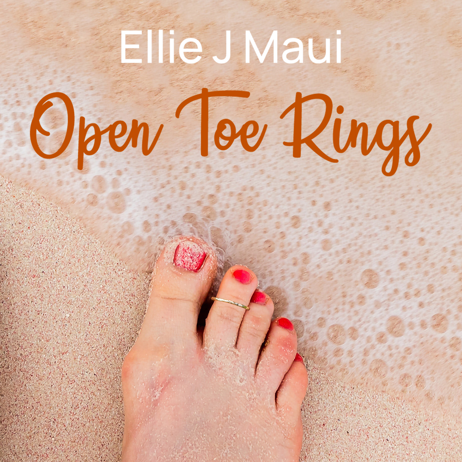
The Beach Hack: When it comes to products related to traveling or fun in the sun, you should make sure that your Amazon product photos showcase happiness and pleasure. You can do this by using lifestyle shots of people enjoying themselves on the beach, having a picnic with friends, playing frisbee, or doing any other activity associated with summertime fun. Incorporating these types of images into your product pages will help create an emotional connection between potential customers and your product. So, if you can, show the beach!
-
The Meal Hack: Don’t just focus on the product. Focus on what that product can bring to your customer – happiness! For example, if you sell food-related products, show off pictures of a sizzling steak and savory dishes. Show a happy family gathering together around the dinner table, friends enjoying each other’s company while they share a meal cooked with your products. Show the compliments received when someone cooks with your products. Show people smiling at each other as they enjoy their meals or even close-ups of delicious dishes prepared with your items which are sure to make mouths water!
-
The Pain Glow Hack: Subtlety doesn’t always sell. Consider ways to emphasize how and why your product is useful. For example, if you’re selling products designed for relieving pain (such as carpal tunnel or toe hotspots), use images that show these painful conditions so customers can easily understand how your product works – test super obvious options like glowing red where the pain would be. This level of simplicity can help shoppers quickly understand the benefits if they see visual evidence of its effectiveness.
5 Best Practices For Creating High-Converting Amazon Product Photos
When creating images for your Amazon listings there are several best practices that you should consider following:
-
Image Quality: Make sure your images are clear and sharp so customers can easily see what you’re selling
-
Image Size & Format: Make sure your images meet Amazon’s minimum resolution requirements (1000×1000 pixels) and are in one of these file formats: JPEG (.jpg), TIFF (.tif), GIF (.gif), BMP (.bmp), or PNG (.png
-
Designing High-Quality Images: Make sure your images are clear and sharp so customers can easily see what you’re selling
-
Using Imagery to Enhance Brand Identity: Use imagery that reflects your brand identity such as logos, colors, fonts, etc. so customers will recognize your brand easily
-
Creating Eye-Catching Images: Use vibrant colors and eye-catching visuals such as infographics or lifestyle images so customers will be drawn to your product
Amazon Image Design Services
Amazon Image Services are services provided by Amazon marketing agencies for crafting high-quality images for your product listings.
These services include photography services (for products sold on-site) as well as design services (for digital products). The services provided by Amazon Imaging Services are tailored specifically for each brand’s needs.
How to Use Amazon Imaging Services?
Brands can use Amazon Image Design Services by contacting the team directly at ecomoptimization.com/image-design.
From there, brands will be connected with an imaging specialist who will work with them directly to create high-quality images tailored specifically to their needs.
Conclusion
In this guide, we discussed 55 image design hacks to help brands jumpstart and supercharge their Amazon conversions. We discussed different types of Amazon Product Images such as The Main Image, Title Image, Lifestyle Images, Infographic Image, Psuedo Testimonial Image, and What’s In The Box Images. We also covered the basics, tips & tricks, tools & software for creating effective images for their listings.
We also discussed best practices for creating high-converting Amazon Product Listing Images such as using high-quality imagery to enhance brand identity and creating eye-catching visuals that draw customers’ attention. Finally, we discussed how brands can use services provided by Amazon Image Design Services as well as image design ideas they can use when creating their own high-quality images.
FAQ
Q: What are Amazon Listing Images?
A: Amazon Listing Images are images used to promote products on Amazon. They are usually displayed prominently on the product page and can be used to draw a customer’s attention to the product as well as highlight the product detail page, features, and benefits and increase customer engagement.
Q: Why are Amazon product images important for conversions?
Amazon product images emotionally draw customers into the benefits of the products, and customers are more likely to purchase a product if they can visualize how it looks, how it works, and what it will do for them. High-quality images that clearly show the features and benefits of the product will help customers make an informed decision about whether or not they want to purchase i
Q: What are the different types of Amazon product images that should be considered for a listing?
There are several types of Amazon product images that should be considered for a listing, including the Amazon main image, the title image (like your cover art), the lifestyle + image, the infographic image, the full image frame, pseudo testimonial image, and the what’s in the box image.
Q: What are the minimum requirements for Amazon main product images?
The minimum requirements for Amazon’s main product images include: professional quality in RGB color mode, a resolution of at least 1,000 pixels or larger on the longest side, a 10-pixel all-white border, the product taking up 80% or more of the space, the product being on an all-white (hex code #FFFFFF) or pure white background either, no excessive shadows or reflections, no watermarks or copyright symbols, and no writing or callouts
Q: What are some Amazon main product image hacks?
There are several hacks that can be used for Amazon main product images, including the flag hack, the box hack, the hand hack (if allowed in the category), the fruit hack, the desire hack, the USP hack, the celeb hack, the box v2 hack, the face hack, and the callout hack (with a backup image files and “safety” image, of course).
Q: Can logos, text, or graphics be included in Amazon product images?
Amazon’s terms of service restrict main listing images from containing any text, logos secondary images, or graphics. However, callouts can sometimes be sneaked in behind the product in a way that the algorithm won’t see it as separate from the product. All visuals should accurately represent what is included in the item’s package and should not contain content that could mislead customers into thinking they are purchasing something other than what is actually shipped with their order.
Q: Why are Amazon product images important for conversions?
Amazon product images emotionally draw customers into the benefits of the products, and customers are more likely to purchase a product if they can visualize how it looks, how it works, and what it will do for them. High-quality images that clearly show the features and benefits of the product will help customers make an informed decision about the product.


